Monday, 7 October 2013

planning and research/ film magazine analysis

 
Layout-
The layout of 'Fangoria' is a cross between slightly chaotic and organised, while certain shapes or pieces of text may seem slightly out of of sync with the rest of the front cover of the magazine. Usually the layout has an organised and well balanced front cover to promote and show magazines.
 
Many conventional features of a magazine front cover are present, for example the masthead is located at the top of the page, above this is the slogan associated with the magazine. There are several sell-lines along the sides of the main image. This is accompanied by Anorchage text below it. A rather signifigant change from the normal convention of magazines is the 4 sub advertisements at the bottom rather than the full attention being on the main image of the front cover.
 
The colour scheme of 'Fangoria' utiilises conventional horror colours such as red and black to connote the genre of horror to the magazine. Typically black colouring relates to darkness and shadow, which many people hold a fear to. While red usually connotes blood and gore - again a popular feature within horror genre
 
A unique and very appealing feature, which i have already mentioned, of the front cover is the 4 sub-images located at the bottom of the page. These are scenes from either recent or very iconic moments of a horror film - the reason i believe this is a very good method is the incorporation of sell lines and topics which are discussed within the magazines to the images - this is very effective at gaining the attention of the reader who recognises these images and can then gather context from the sell lines above. Also, the sub-images help the reader recognise and relate to the genre of horror and the theme of the magazine. Although it does appear quite amateur it does add a level of depth. 

Thursday, 3 October 2013

research and planning/analysising of potential poster pictures

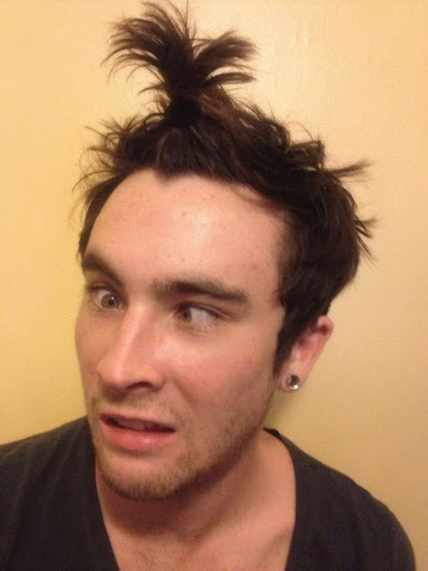
This is a picture that has been taken that could potnetially be used for my movie poster, i like this picture as it captures both the comedy, yet potential horror within this picture. I like this picture as with some editing it could look as though our character is possessed. I would zoom in to the eyes and use one eye as my main picture. I would try and edit something within the eye to make the character look possessed, this would contirbute to the horror but keep the comedy aspect to the picture. The lighting within this picture is ideal as it it not overly yellow from artificial light, and can be easily edited. The picture is also clear and not blurry so it would look like a professional picture.


I also like this picture as a potential movie poster as yet this also captures the comedy and horror, personally I do this this picture would be better used within my partners poster as she will be doing a portrait poster, yet i will be doing a landscape movie poster. I believe that this picture would fit in better with hers as she will be doing a spoof poster of insidious, and this fits the convention of the picture that was used within the actual movie poster. 


research and planning/film poster analysis


I have chosen to analyse a landscape poster as i was thinking to use a landscape poster within the making of my poster, I thought that this would be a good example of a poster as i was intenting of using an extreme close up shot of the main characters eye which shows a difference within the eye to show a possesion of some sort within my character to give a ordinary convention of a horror film poster to let the audience know that this is indeed a horror film, even though it does contain comedy through it being a spoof.
With analysing this poster i can see the main image will need to take up most of the poster.
The text going along the front of the poster draws attention from the audience to the poster